No matter how hard I’ll try, I will never be able to determine what is the real number of Linux users, and share it with you. This article is not about market shares directly, nor about judging or analyzing the reasons behind the users hesitation in installing/using/adopting Linux.
This article is meant to provide some food for thought, concerning the (probable) surcease of Linux growth. I am not saying I know something for sure here, I am just having this feeling that 2011 was the best year for the Linux desktop and will try to share a maybe somewhat premature picture, using multiple information sources. Note that when referring to Linux I mean GNU/Linux distributions and not the kernel alone so Android will be considered something different here.
————————————————————————————————————————————–
I will begin with data from the popular W3Schools.com web developer information website. What we see here is the Linux market share from 2003 to 2012. The website provides monthly statistics but I took the liberty in creating a diagram showing the average value for every year to get the whole picture.
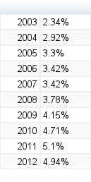
These statistics derive from and represent the W3Schools.com visitors so in reality Linux users market share is way smaller as users that visit this website are technology enthusiasts, developers etc…
————————————————————————————————————————————–
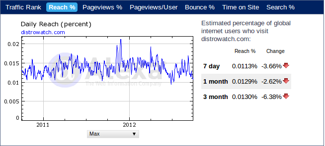
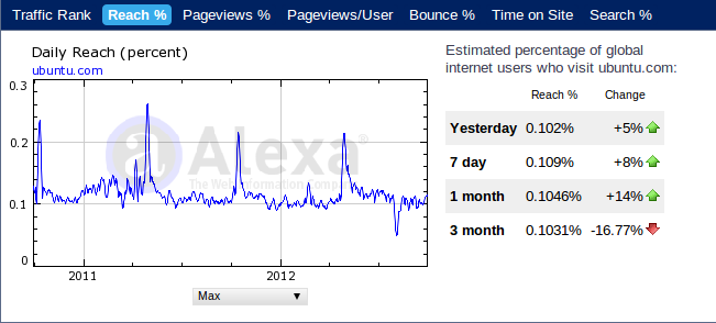
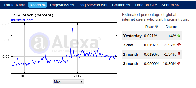
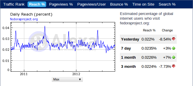
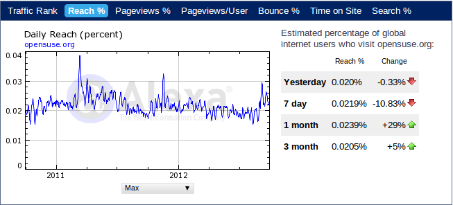
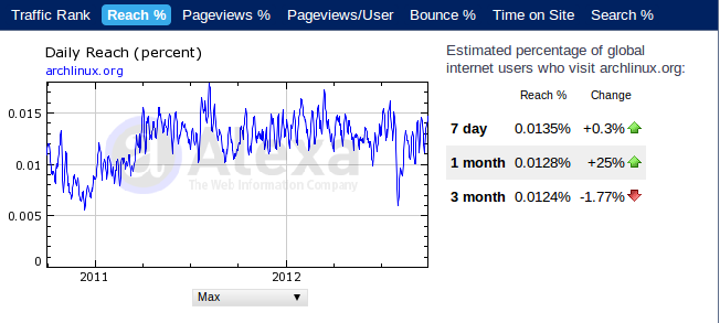
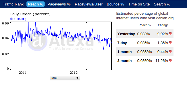
Continuing with Alexa.com, a website that allows us to get an idea about how many visitors a website has and how the numbers of the visitors changed from 2011 to 2012. On the below diagrams you can see how the most popular distributions and distrowatch.com did.
What we see here is a general decrease of visitors for almost all popular distributions websites that actually shows the interest decline. What I believe to be extra characteristic is the reduced interest in newer releases compared to elder releases. What we certainly don’t see here is actual growth. There is no sign of growth of interest even for the most popular Linux distribution that is Ubuntu and even when the latest release is an LTS one.
————————————————————————————————————————————–
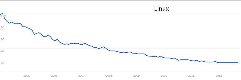
Checking Google Trends only confirms the validity of the Alexa data. Trends is based on Google Search to show how often a particular search-term is entered. I entered various Linux-related keywords and they all gave a decline of interest from 2004 to 2012.
As a side note, I could say that Linux Mint and Mageia Linux are the only major distributions that show rise in both Alexa and Google Trends but are still away from the numbers of Ubuntu (especially Mageia).
————————————————————————————————————————————–
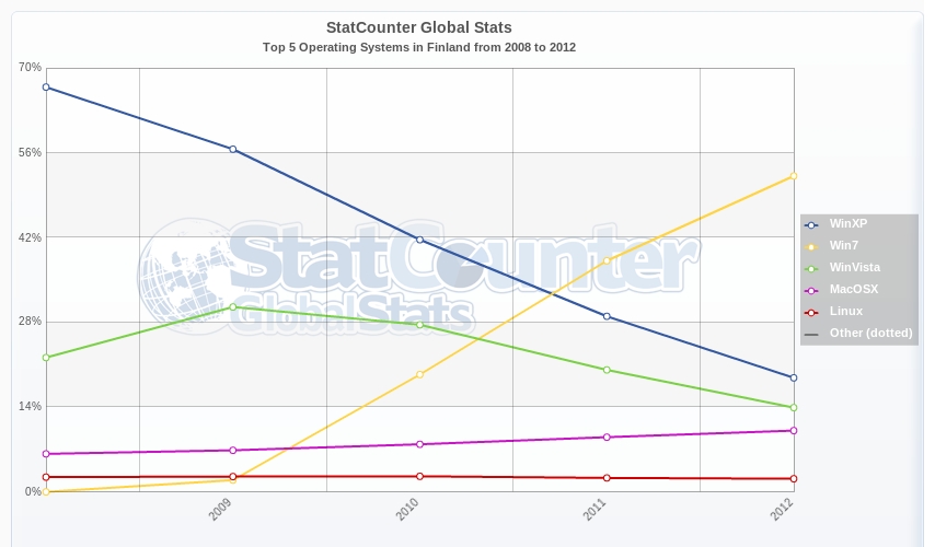
Then I took a look on StatsCounter.com where Linux users were below 1% Worldwide so there isn’t even a line to see. Alternatively I checked Linux friendly nations where Linux counted 1% to 2.5%, and saw no real/significant trend for growth. In contrary, you can notice a small decrease here.
————————————————————————————————————————————–
NetmarketShare.com was my next destination and the results were not good once again. Linux is showing no real sings of market growth from 2011 to 2012. Instead, you can see a small decline here too.
————————————————————————————————————————————–
What I really feel is that Linux is actually experiencing a small market decline at a time that our market share should be steadily increasing. Is this just a bad period, or the beginning of an even greater decline? Is this something that has to do with exogenous factors or with Linux itself? Is Linux market share really in fall or is this an illusion?
As statistics are really no proof of anything, I can draw no conclusions. I give you the above numbers, graphs and percentages as a motive for further discussion.


