Today is the day! Finally my favourite browser Google Chrome has hit the Android Market; well, when I am already quiet in habit of its rivals Opera Mini and Mozilla’s Firefox on my android device. After working with the Chrome browser for the entire day I have gathered my impressions about the browser; what is good, what is yet to be improved. As I am mostly used to Opera Mini browser on my mobile devices, I shall compare the two browsers in my post.
Google released a beta version of Google Chrome for Android devices running 4 version codename Ice cream sand witch last day. If you have a device, Google Nexus or ICS powered tablet you can find the new family member right on the Android Market. Google Chrome for Android is essentially the same as the browser for desktop. Fortunately or unfortunately the browser has tremendous resemblance with Dolphin HD, another very famous browser for Android.
Let’s get started with the comparison/ evaluation.
The user Interface
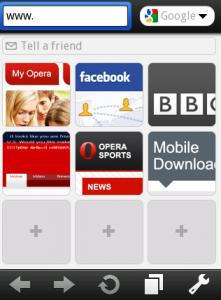
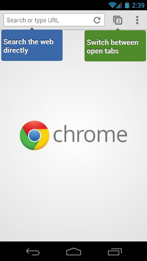
The UI is minimal, comprising of the omnibox on the top that is the address bar and the search box in one. Within the omnibox is the refresh button. Next to it lies a button to switch between the open tabs while at the very end lies the ellipsis button for more options. When comparing the UI to that of Opera Mini, I appreciate the Opera Mini nice UI equally if not less (and in fact it’s not about appreciating, it’s more of a matter of being habitual). The Opera Mini has two separate boxes for search and URLs. I have always disliked the separate text boxes as I almost always happen to type the search query in the Address bar. Chrome’s omnibox is more than welcome, in this regard.
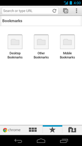
Once entered Android, as you open a new Tab you will find the recently visited pages, bookmarks and synced tabs from your desktop’s chrome or chrome on other devices such as your tablet (discussed later on). Additionally as the traditional bookmarks bar is replaced by tabs you, there is no obvious way to put bookmarklets. Nevertheless for some popular bookmarkets, such as the InstaPaper, you can find a dedicated app. For other less popular bookmarklets you are in a trouble! Overall, the UI is sleek and convenient.
Tabbed browsing experience
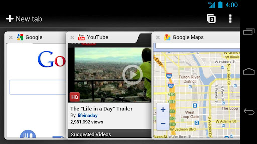
The tabbed experience, is both good and not-so-good. All the tabs you have opened are piled one over the other. Unlike the tabs in the Opera Mini that are arranged side by side. I found this arrangement slightly untidy. The good thing is that you can swipe from the side of any web-page and you shall be taken to the next open tab; a feature common to Symbian and blackberry phones. As I am used to open a lot of tabs this stack view was a bit inconvenient. Also swiping from tab to tab is only handy when you have a handful of tabs and you already know the order.
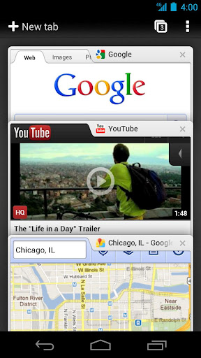
The tabs arrangement is rather better-looking when you tilt the phone to landscape more.
For a final complaint: The icon for tabs was also slightly smaller for the phone but better-looking on tablet.
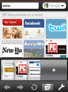
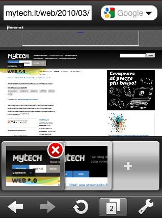
Tapping the button pops up previews of the pages, every page arranged on top of the other, in a card-like-style. You can dismiss webpage corresponding to the thumbnail by flicking its thumbnail left or right; this design tweak is not very straightforward for a layman. Alternatively you can press the cross button. From the mini Opera experience, I like the slightly magnified cross button appearing with the thumbnail preview. Also in the Opera Mini when you press the tabs icon the live thumbnail view appears in a slide arranged sideways. I prefer the side-way arrangement than the staked view.
Incognito Mode
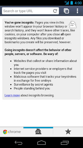
The good thing is that you can browse the web in incognito mode. I have seldom used this opportunity on my personal desktop so I find it somewhat pointless in the mobile too; as your phone too is your personal device. Incognito mode is good for a public or home-computer but probably not for your personal devices, my view.
Synchronization
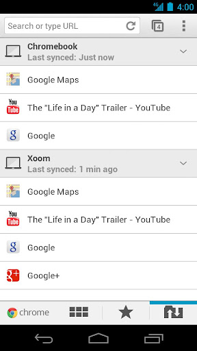
If you use services like InstaPaper or ReadItLater you are freed from the hassle now! The new Chrome to Android is a blessing. It synchronizes all your bookmarks from your computing devices on which you use Chrome. So what’s new? Opera Mini and Mozilla’s Firefox offers that too? The best thing is that the new browser also synchronizes the open tabs. So no matter where you are you can pick up your browsing on the go! To do so simply touch the “other-device” icon on the new Tab and a list of Chrome devices (on which you are signed in with Google account) will list up. As yet in the beta mode, this feature is lagging as yet; however having included this synchronize option is itself a well-appreciated move.
Password management is great for almost all Google related services. This feature is very nice as I am always lazy to type on touch devices. The best of all the features is the speed enhancements. Although as yet, we don’t have the benchmark results yet the browsing speed is increased and that is evident.
What is missing?
1- Google Chrome for Android does not support Adobe Flash. At the moment I don’t see any problem with that but definitely this can have some unwanted consequences. Dolphin HD, on the other hand supports flash. This might keep some people sticked with it or Mozilla.
2- Google Chrome for Android is only available for Android ICS. This means only a handful of devices can enjoy the new chrome. Infact you can name the devices, Google Nexus phone, Xoom 2tablet or ASUS Transformer Prime. Also note that not all these devices are available world wide as yet.
3- The power of Google Chrome lies with the myriad extensions. Chrome for Android does not support extensions yet.
Google Chrome for Android is a much anticipated and very polished browser and it is a great opportunity to have a similar browsing experience as on desktop. Chrome is yet in beta version and it is evident that with several iterations, Chrome will emerge as out-standing browser even for mobile platform.


