If you’ve read our review on Ubuntu 16.04 LTS, the you will be familiar with our great displeasure of what we were offered. Not to dwell on it too much here, but we are committed to finding something a little better. We’re glad to be able to say that we did – and it’s called Fedora 24, or F24 as we’ll call from this point on to keep things simple.
We have grown accustomed to the generally pleasing aesthetics of a finely polished and refined Fedora desktop. With a tone of arrogance, we’re going to proudly put the word out there that we have come to expect it. F24 does not disappoint.
It’s so much better than Ubuntu 16.04 LTS and equally better than its predecessor F23, which was itself absolutely brilliant.
The desktop is fast and responsive and we could not find anything noteworthy which could discredit the impression it has left on us. Want to know more? Read on.
GNOME 3
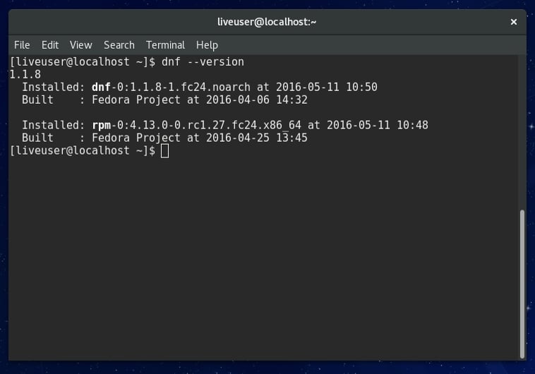
It has been some time since we visited a Linux distribution running the GNOME 3 desktop. The build of F24 we used for testing contained a GNOME 3.20.1 environment. Crucial components which made up the build were Linux kernel 4.53-300, Bash 4.3.42(1), RPM 4.13.0 and DNF 1.1.8-1.
At the time of going to press, we’re going to presume that the majority of crucial components that make up the core system of F24 have been updated. But that’s what we used and experienced no issues with any of the aforementioned packages. Anything from here onward will be bug fixes and security patches.
Office Suite Integration
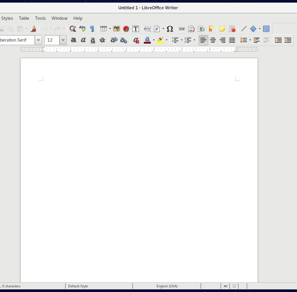
We’ve become quite critical of the interface of LibreOffice in past reviews. Microsoft Office is (still) the standard in office suite software. Whether you agree with the definition of ‘standard’ and whether you believe MS Office should be the standard, or favor a free and open-source alternative like LibreOffice or Apache OpenOffice, is a moot point at this stage. The industry still considers MS Office the standard and it remains the package which all others strive to replicate or follow when it comes to interface design and features. Generally speaking, we believe that the FOSS alternative office suites offer users a fantastic experience which is capable of replacing MS Office with very little complication.
What we really want to poke at is the user-interface of LibreOffice. Its developers have failed to update the interface to meet the fine polish of GNOME 3 (and other desktop environments which focus on eye-candy), in this case F24.
This in no way reflects any lack of quality and attention paid to functionality, but aesthetics do count for something, for more than just a few picky users. If you want a Linux office suite that does offer something a little more fresh and more aesthetically pleasing on the eye, then we recommend you dump LibreOffice in favor of WPS Office.
It does a much better job of user-interface integration and somewhat replicates the MS Office ribbon interface, for familiarity for those who feel comfortable in MS Office. We understand that WPS Office also has better support for Microsoft proprietary file formats of DOC, DOCX, XLS and XLSX to name a few.
LibreOffice just feels like it has reached a stage in its development where it has stalled on innovation. A major redesign of the user-interface would be great, but we still don’t understand when that will happen or whether it is planned. But Linux distribution developers need to seriously consider their options for better packages if absolute integration is key. At the
moment, LibreOffice is failing so many distributions in the eye-candy stakes and there are better alternatives available. WPS Office should be one of these alternatives that needs to be considered for the future of the office suite on Linux.
As much as we embrace WPS Office on the Linux desktop, there is a catch! And upon closer analysis, the catch is also the primary reason it is not yet being considered for inclusion by default by Linux-based operating system distributors – it is not open-source. It is freeware, but the source code remains closed at this point. This creates a hurdle in the works and goes against the founding principles of Linux and the free and open-source software movement. Therefore, until the source code is opened up and open file formats are embraced for WPS Office, it is never going to be included out-of-the-box on any mainstream distribution that follows the FOSS principles with genuine intent.
Our advice is simple – install both. In the my office, we use both Apache OpenOffice and WPS Office. At the end of the day, the choice is simple. Are you happy with LibreOffice/OpenOffice and embrace its free open-source heritage and are willing to sacrifice better desktop integration with its user-interface? That’s fine. Stick with it and we’re sure you’ll remain content with your decision. If you don’t mind the closed-source nature of your office suite in favor of better desktop integration, then give WPS Office a whirl and we’re sure you’ll find it meets almost all of your office duty requirements. But we do wish the source code would be opened up and the freedom software culture embraced by its developers.
Admittedly, we have gone off-track a little. So let’s get back to our review of F24. Carry on.
Desktop Integration
While we had some gripes with the integration of LibreOffice, other software inside GNOME 3 looks just great. The entire F24/GNOME 3 desktop feels like it has matured and a very real and viable alternative to traditional functioning environments like XFCE and the popular GNOME 2 fork, MATE.
If you want something fresh, we highly recommend GNOME 3 and F24.
Over the last couple of years we have become quite accustomed to having our window control buttons on the left-hand side of the title-bar of windows. Yes we know, Mac style! GNOME 3 still offers no easy way to move these button from the default right-hand side. At least not via a graphical method. So if you’re like us and want to move the windows buttons to the left, then you’re going to have to get your hands dirty and dive into your terminal console to get the job done.
Whilst there’s not really any major issue or set-back, we’d like to see a quick-way to do this via the graphical user-interface, much like other desktop environments have made it easier for their users to change these relatively simple window settings. Because at the moment, GNOME 3 is dragging the chain on this one.
The Software package has been updated and taken an approach which resembles the ‘Ubuntu way’. It behaves much more like a marketplace than a package manager. Our testing of installation of various software packages and applications was perfect. Regardless of our personal feelings towards these modern era marketplace-like application managers, all testing performed was flawless. Integration with the desktop environment of GNOME 3 was pretty good and it all feels like it’s ‘at one’ with each other.
The Hidden Gems
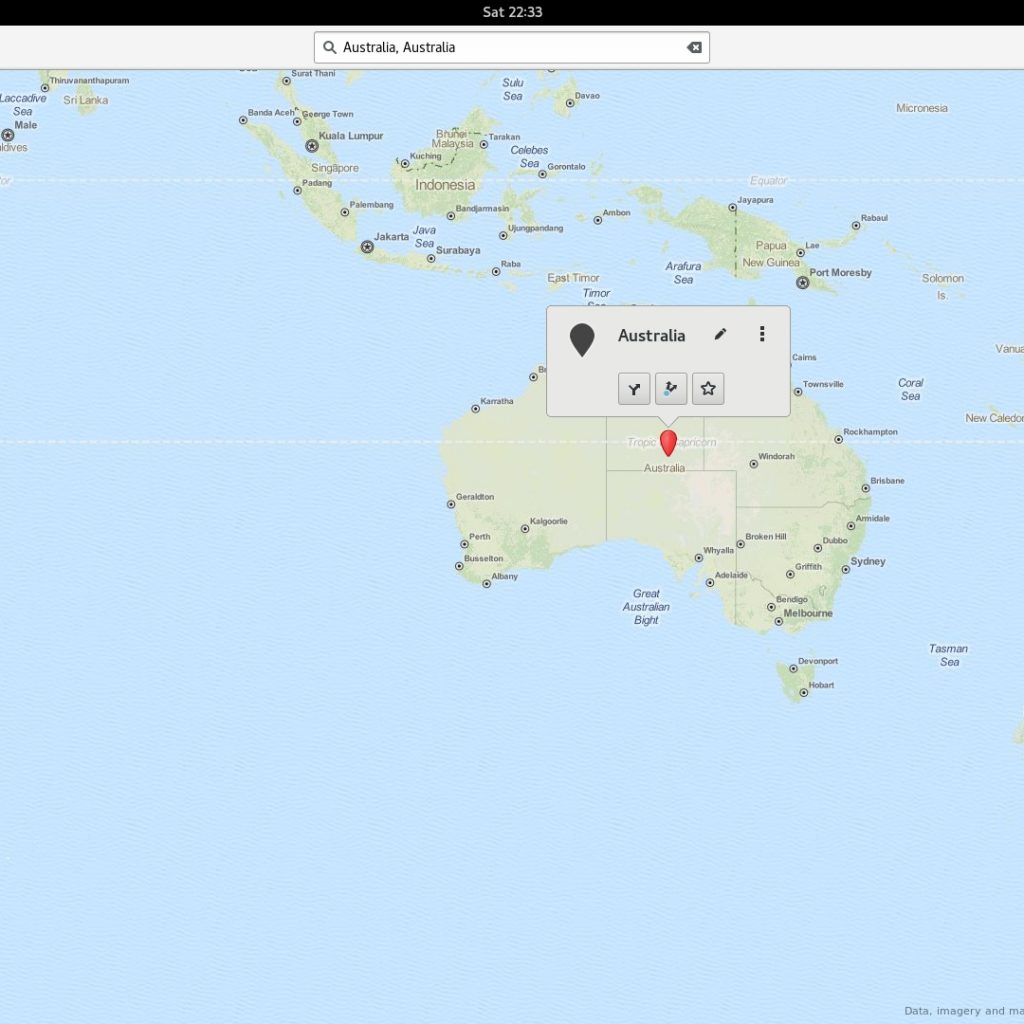
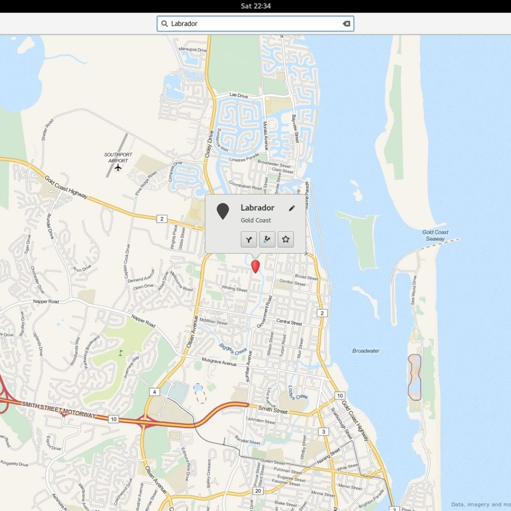
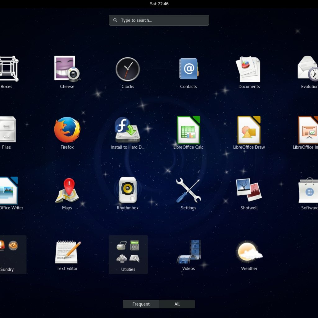
When we explored the applications installed in F24, we noticed Maps. We toyed around with the Maps application and are happy to tout its excellence. It’s a nice addition to the entire application suite and essentially cuts out the task of opening your web browser which then requires you to navigate to Google/Bing Maps. Whilst that’s not exactly difficult, it can be a little cumbersome.
Maps is great and it behaves very similar to that of Google Maps. So if you’ve ever used any other online map tools, then you’re not going to have any kind of trouble using this inclusion.
We played around with it for quite a bit of time, attempting different places, streets, towns and cities in different countries and it remained accurate at all times. Performance was excellent and we were actually really impressed, left baffled why we had not stumbled across this before in other Linux distributions.
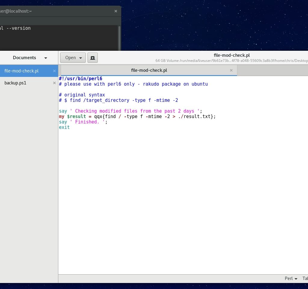
Looking at some other core packages that build up the F24 system, we were especially drawn to the default Text Editor that comes with GNOME 3. To most advanced programmers and coders, default text editors are usually frowned upon, often wrongly assumed to be ill-featured and just not as powerful as more focused and customizable packages like Emacs and Vim. There was an element of truth to these assumptions at one point in time. But default text editors have come a long way and we would be more than happy to bang out a Perl script or some quick C++ code using the default GNOME 3 Text Editor.
It looks brilliant and has excellent features and programming language support. Just to mention a few highlight features, full-screen editing mode and syntax highlighting accompanies strong language support. Power, functions and good looks to boot. Whether you still prefer Emacs, Vim or even Visual Studio Code at hand for your coding needs, also consider the GNOME 3 Text Editor as we’re sure that you will not be disappointed by the addition.
We were equally impressed by the default GNOME Terminal Console. It’s brilliant! Most terminal users take their console environment pretty serious (as I do) and spend quite some time tweaking the configuration to get the environment balance to perfection. This is the reason that some users still prefer third-party terminal console packages. They sometimes offer a little more power and tweaking ability. GNOME Terminal Console is visually impressive and feels like it matches the power of third-party packages with very few tweaks required. We had no issues with it during our testing and we used it quite a bit! We would happily use it on a regular basis without complaint and without the need to consider a third-party package.
Let’s take a look at email. Although any sort of commentary on email can be mind-blowingly boring, we feel the need to bring our concerns to the attention of the reader. The default email program in F24 is Evolution. Yep, still! Evolution is another one of those programs that seems to have just dated more than others. Although it is constantly maintained, it does feel like its designed for the ‘traditionalist’ user, rather than the ‘modern’ email user. We believe that Evolution should be replaced with something like Geary or even Thunderbird. Although the latter is starting to fall on the same path of Evolution. Some of our readers may not agree with us and that’s fine. It will come down to what you expect from email and how you wish to access it. But we felt the need to mention our own thoughts.
On other defaults, we still believe that GIMP should be included by default and Shotwell should be dropped in favor of gThumb. With the latter doing a far better job of image viewing and management. We’re just not fans of Shotwell and are still unsure of why Linux distributions like to have it included by default. It’s a mystery.
In summary, we can not commend GNOME 3 and F24 enough. It’s excellent and as finely polished as you will find in a GNOME 3 based Linux distribution and by far the best we’ve had delivered to us from the Fedora camp.
Conclusion
We run out of time to have a play around and do any kind of serious testing of the Boxes application. But we have been reading about it and understand it is a virtual machine package, designed to run sandboxed virtual machines. Yes, similar to Oracle VM VirtualBox. We intend to look more into the Boxes feature a little later down the track. So we will bring you more information on it soon.
We tested Fedora 24 running in Live Mode, performed a real-time installation and also performed an upgrade of an existing Fedora 23 system. Upgrading 23 > 24 involved sourcing ~1.2GB of packages over the network. Yet the entire process was flawless. In fact, all of our testing was enjoyable at all times and we never experienced any problems during what we considered pretty extensive testing.
Fedora as a distribution has only been getting better and better as each new version has been pushed out over the years. Sadly, Ubuntu has somewhat been going the opposite direction. Fedora has become a very powerful and respectable distribution. It now has great package support and many packages that you used to have to go hunting on third-party websites just to source an RPM package, are now included in the default repositories. Off the top of our heads; Terminator, scrot and feh are just a few that we had to go hunting for in previous iterations of Fedora, but not any more.
Without the immediate need to go searching for obscure packages not included in the default F24 repositories, combined with an excellent performing and visually pleasing GNOME 3 desktop, we have no problem recommending you give Fedora 24 serious consideration as a candidate for your next Linux distribution to make its way onto your hard disk.


