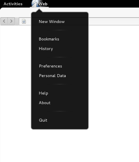
First off, Application Menu has not any similarity with Unity’s Global Menus. While Global Menus copy the Window App Menu from the usual spot (inside App) into Unity’s top panel -the Mac style-, Application Menu, is one single menu that steals some elements from Window App Menu and places them in a drop down – no submenu-ed – menu over Shell panel.
So in what perspective we choose which menu item should belong to Application Menu? The simplistic answer is “Every menu that changes the current state of the whole Application (eg. Close App) belongs to Application Menu, while every menu that affects the current working window of the application belongs to the Window Menu”.
Semantically this approach sounds perfect, but on practical use is quite broken. On my opinion what GNOME is trying to achieve with this technology is to talk into developers and say “Hey, we have to find a way to standardize the Menus Hierarchy”.
This always has been the case with the menus. For example when we open “File” we are expecting to see something like “Save”, “Save as”, “Import/Export”, “Close” etc, no matter the application, no matter the OS that runs on. So in a manner we already know what a menu should contain before we open it.
Consider that we run one File Browser, a Libbre Writer and a Web Browser. All these 3 different applications have the “File” menu. File menu is ok for Libbre because Libbre actually edits files. On File Browser file is somehow ok because we can edit any kind of files (media, text etc) plus we have Folders that aren’t really files, at least on a real word example. On Web Browser we have an HTML container of files and scripting and File word is totally obsolete.
My point is that the “File” keyword is not the right one for all the cases. So what if we replace the “File” with ..hmmm …Application Menu.. Isn’t more fair? On a further step, who manages the Applications? Shell. So what better than applying Application Menu inside Shell Area.
GNOME’s people weren’t the first ones to discover this approach. Google’s Chrome is already using it since its very birth. If we take a look on Google’s services we’ll see that Google isn’t using “File” in Chrome, isn’t using “File” in Drive (their new web-based file browser and storage service) but it uses File on Docs. Perfectly normal, you don’t have to be Einstein to think of it.
Application Menu affects (if I am not wrong) on 3.4 a few apps, Web (old Epiphany), Boxes, Contacts, Documents & some Gnome Games. I will take as example my favorite of the above applications, Web.
Web is a good example case of Application Menu. Even if a Web-Browser is by far the most critical and intelligent Application, it populates the same number of menu items as the Gnome-Terminal. Even if the Web is developed with Application Menu on mind, and even if it has not complex menus it fails big time. I will only give 1 quick example in order to keep this article as small as I can.
- Pic1- Web’s Application Menu
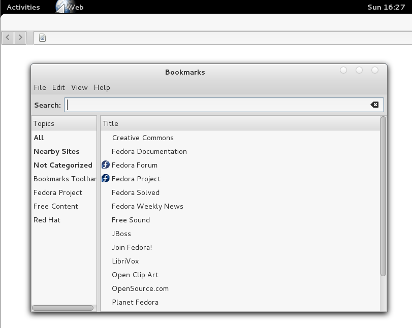
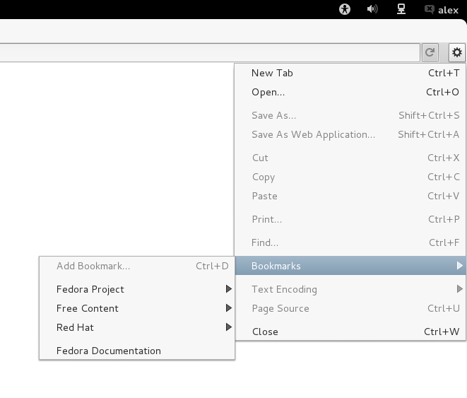
Web has “Bookmarks” on both Application Menu and Window Menu. Clicking on Bookmark Application Menu a separate window opens that let us to organize our bookmarks or we can open a bookmark on a new Web Window. The worst of all is that this separate window, has its own menu with “File”, “Edit” …etc options. If we have on focus this SEPARATE window and we press quit from Application Menu, the whole Web will close.
- Pic2- Web’s Application Menu Bookmarks
- Pic3- Web’s Bookmarks
On the other hand Bookmarks Window Menu let us just open the bookmarks that we have edit on Bookmarks Application Menu on a new tab.
That mess makes me wondering, that if they can’t complete a working example of Application Menu concept on their very own and simplistic product, what makes them to believe that they will achieve that on more complex applications that are developed from other people that they just don’t care?
Well thankfully we have the answer of this from official GNOME page. For Apps that use complex menus like Libbre, Gimp Inscape…
“This is not a problem – it is fine for such applications to keep their traditional menus”
..this is a bit naive thought, isn’t it?
At this stage of GNOME, we should always check if an application has Application Menu, and if it has we should double check if there are menus with the same name that they do different things.
Fortunately you can assume that if an application is quite complex, most likely will not have an Application Menu. On the other hand if an application has simple straightforward menus, what it needs the Application Menu for?
Application Menu also introduces a new full screen mode for Applications. But this is another not very happy story…
My final conclusion is that Application Menus are smart as a global idea but dummy as implementation at the current time. Well, you can justify this a bit claiming that is a work in progress…
You can read an interesting menu usability guide and also an Application menu design guide on Gnome Live


