Today, I installed Firefox 4 beta. My very first impression when the new browser opened was “How much like Chrome!” On exploring ![]() Firefox 4 beta I found the design and functionality has incredible likeness with Google’s browser Chrome. In this post we will deem at the new features of Firefox and comment on how they look alike Google Chrome.
Firefox 4 beta I found the design and functionality has incredible likeness with Google’s browser Chrome. In this post we will deem at the new features of Firefox and comment on how they look alike Google Chrome.
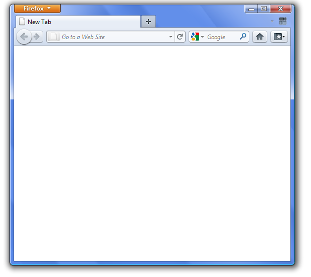
Interface: I had always been an admirer of the sleek interface of Chrome that Google claimed to have so designed to maximize the internet experience of user as if they were viewing webpages without any web-browser at all. Firefox 4 beta has modified its design to make it cleaner and much simpler, no extra buttons or several text boxes.
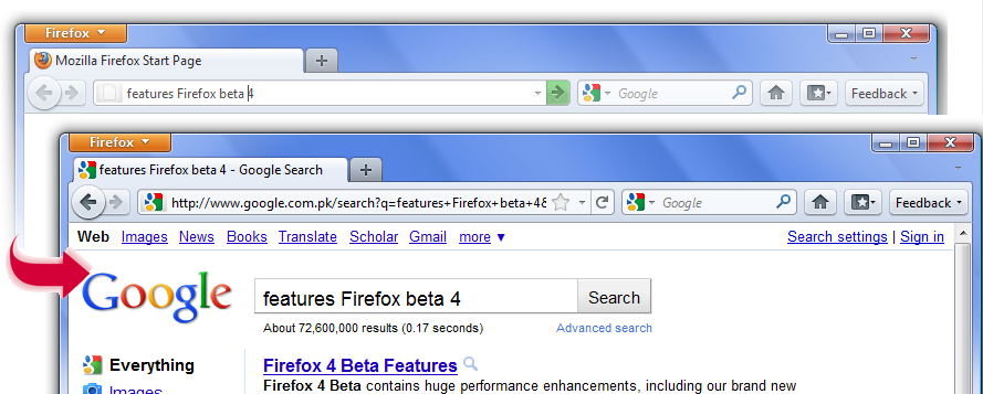
All in one bar: The address bar is the search-bar. The idea firstly found in chrome.
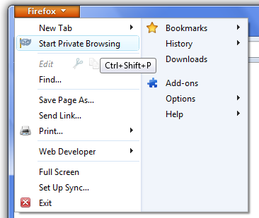
Private browsing mode: Firefox 4 beta has introduced Private Mode Browsing in its upcoming version, another inspiration from chrome (incognito mode).
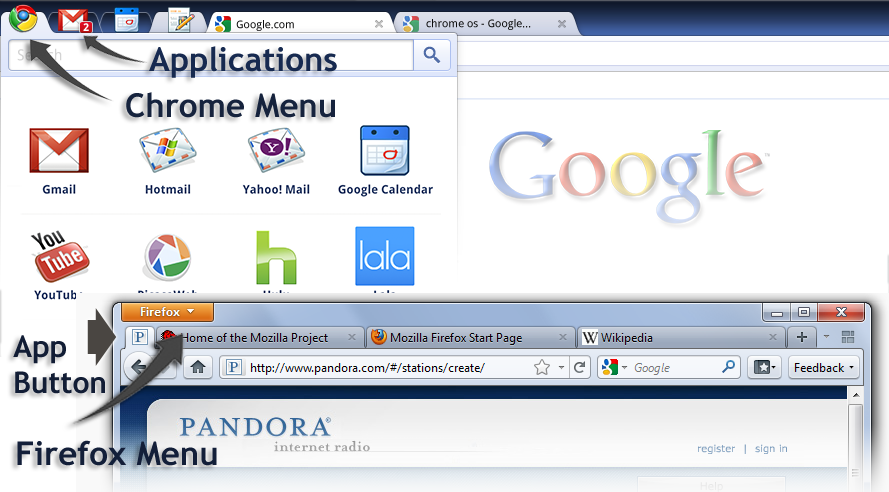
Firefox button & Application’s Tab: The Firefox 4 beta has a Firefox button where all the menu items are constituted. The Firefox website also introduces an app tab that will house your most viewed pages (on installing and running Firefox 4 beta I could not find it). The concept though reminds me of the browser that Google promised in its OS. The browser (in chrome OS) combined the webpages, Chrome Menu and User Application in a single thin strip on the top of the browser. The image below compares the two:
Full Screen Browsing: Full screen browsing is enabled in Firefox 4 beta version, the feature that already existed in chrome (Press F11 to enter the full-screen mode). Returning back to normal mode (from full-screen) was difficult for me. Minimizing and then maximizing the window solved the problem in my case. The ESC key, as expected to bring back to normal-mode dint work.
What is missing till yet?
Flexibility with Tabs: Chrome is all about tabs that one can grab and drop anywhere, between any tabs or as a separate window. Firefox 4 though does not offer flexibility to manipulate tabs. Nevertheless, any tab in Firefox beta 4 can be pulled down to make a new window.
Task Manager: I was really looking forward for this feature in the new Firefox 4, as it was of great utility in chrome. The Task Manager in chrome allows one to see which of the web pages opened in your tabs are consuming most resources. However this feature is yet absent in Firefox 4.
New Window: When you open chrome, you find thumbnails from your recently visited webpages. These thumbnails tremendously help one to access their desired webpages quickly. This feature is missing in Firefox 4 beta aswell that opens a blank page when you open a new window/tab. However to facilitate easy access of pages an App button is introduced in upcoming Firefox 4.
Even if the Firefox 4 beta 10 has its inspiration from chrome UI, I had a great experience when working with it. In my opinion, good features must be widely adopted, even if they are invented by your rivals. These are my first impressions about User interface and prominent features of Firefox 4 beta 10. You can download and run the application and also send your feedback to Mozilla for improvements. Firefox 4, still in its beta version has a long way to go and I feel that Firefox 4 will be more stable and built around a better technology to improve performance drastically.


