Your productivity with a smartphone is primarily reliant on your smartphone’s browser, as most of the tasks on a smartphone are done in your mobile’s browser. This makes job of mobile browsers even more though; after all it’s not about simply rendering webpages, it’s about delivering a cost-effective, smooth internet browsing experience at its best.
Browsers, in many ways are becoming the heart of Mobile devices today. Browsers run every kind of applications, used for gaming, watching videos and much more. Today we are lucky to have an option of selecting a browser from the Android market besides the default browser.However, obviously not all browsers are equally good. They have their strong and weak points. The post evaluates selected browser with respect to performance, interface and usability and finally compares one with the other.
The Contestants
The browsers we have selected to show up in the mobile browser war are enlisted:
1- Google Default browser: The device comes with a default browser. Owing to the android OS and device fragmentation the default browser on every android device varies as manufacturers happen to add their custom skin and features in it. However here we are referring to the stock browser found in the original unaltered Android installation.
Most notable 3rd party browsers participating in the contest are:
2-Opera Mini 7.0.2: While both Opera and Opera Mini are available on mobile devices, Opera mini of the two browsers is particularly optimised for web browsing on mobile devices. Apparently Opera mini and Opera have striking resemblance when it comes to UI; the magic lies behind the UI. Opera Mini uses Opera’s advanced server compression technology to accelerate surfing on mobile device.
3-Mozilla Firefox 10: You can enjoy your favourite desktop browser right on your android device with most of the vitality. Mozilla Firefox for android is optimized for browsing on your mobile platform and particularly for devices with touch screens. Mozilla Firefox encompasses some very beneficial features like ability to synchronize with desktop browser, location based browsing and sharing in the go.
4-Google Chrome beta: Google ventured with its own browser chrome in the browser war. Though once again late, when 3 rd party browsers have already taken the stage, we expect a lot from this browser. Google chrome yet in its beta phase, is very promising with features like synchronizing open tabs from your desktop, sleek UI ( the signature of Chrome) and the ability to send pages from desktop chrome to your device with one click and read them on the go, even if you’re offline.
5- Dolphin HD 8. 0.1: Dolphin HD, looks much like Google Chrome on desktop, is one of the popular browsers at the Android market with more than 5 million downloads. Dolphin Browser is the world’s first Gesture, Sonar and Add-on enabled mobile web browser on Android.
Device used for testing:
The speed of internet browsing is greatly dependent on processor and memory of device. Therefore we opted to test the speed of browsers on three types of devices:
- The HTC One X: Quad core Smartphone
- Galaxy Nexus: Dual core Smartphone
- Nexus S: Single core Smartphone
All the three devices run Android version 4.0. It must be noted here, that there are only a handful of quad core tablets ( like the ASUS Transformer Prime) and smartphones at this point of time but we expect to see lot more mobile devices featuring quad core processor in future therefore we have included HTC One in our testing. As yet, dual core and even single core smartphone are prevalent in the market. Also we have emphasized on feature and UI comparison of browsers than speed tests as speed of web browsing is also Internet connection dependent. So let us find how the browsers Show up against one another in the browser war!!
Page load time
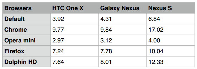
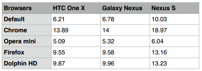
Web browsing is mostly about how quickly your web browser loads a web page. We tested the browsers by loading 2 different webpages; first a simple Wikipedia web page with text and image and another page with many images (that was the HTC One X page). Then we averaged the time each browser took to load both the pages. The results so determined are listed in from of table here:
Page load time on wifi network:
Page load time on cellular network:
The above observations yield:
1- Opera Mini outshines its counter parts with quiet a margin in page load time. This is because Opera Mini uses Opera’s advanced server compression technology that compresses web content before it loads on your device. Therefore, as processing- intensive tasks such as page processing and image rendering takes place on the opera server and the device only loads highly compressed content sent by the server, the web browsing experience is screaming fast irrespective of connection and device. Also you can adjust the image quality to further accelerate the page load time. You will also see that opera mini performs equally good on considerably slower cellular network.
2- The page load time of quad core and dual core smartphone is minimal. This makes selection of browser all the more important on quad core devices.
3- The difference in page load times significantly varies from single core to dual core processor.
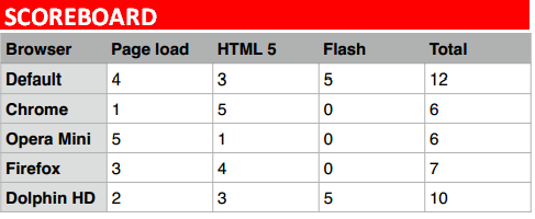
4- Following Opera Mini is the default Android bowser and Firefox. Dolphin HD lags behind with a minimal margin. Google chrome beta acquires the last place.
Compatibility
While all browsers attempt to give a desktop like browsing experience it is certainly not possible to view the web with all it’s glory on your mobile device. This is because mobile browsers have compatibility issues. Here we have selected HTML 5 and Flash to test browsers compatibility.
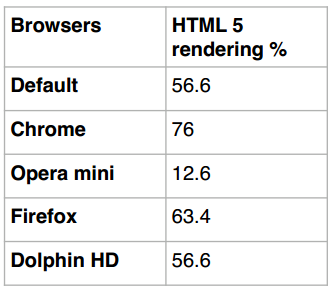
HTML 5: When it comes to HTML 5, which is quickly gaining popularity replacing flash, we expected mobile browser to underperformance. We tested each of the browsers by accessing the website html5test, which evaluates how well your mobile browser renders HTML 5. Google Chrome Despite being in its beta took us with a pleasant surprise by rendering HTML 5 considerably well, scoring best. The % score of browsers is enlisted in table below. Google Chrome is first while Firefox acquires the second place. Opera mini lags way behind. This is evident that opera mini is not a browser for enjoying complete web experience.
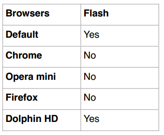
Flash Support: Though HTML 5 is replacing Flash in modern web design but the fact that quiet a lot of websites still employ flash cannot be denied. Therefore it is imperative to test browsers for Flash compatibility. Not surprisingly quiet a lot of browser don’t support flash including our winner from the last category.
So what about the scoreboard? (maximum score for each category is 5)
User Interface and Usability
To like or to dislike UI of a browser is purely a matter of personal preference but there are some characteristics that we all like; such as sleek interface, easy to use omni- bar, smart suggestions for address bar and search query, easy tab management and easy to use bookmarks.
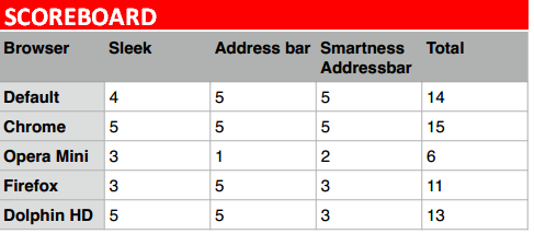
The interface: The interface of all the browsers in the war is no doubt sleek and minimal. The default browser in ice cream sandwitch has been pleasantly redesigned and it is way better than its gingerbread counterpart. The UI of Dolphin HD is much like Google Chrome desktop version. If you talk about easy to use and self explanatory interfere I will prefer the Dolphin. All the UI Elements are well placed.It has side bars, smart address bar on the top and comprehensive interface with which anyone can get along after a minimal attempt.
Address bar: All the browsers have a 2-in-1 smart bar that is address bar as well as search bar except for Opera mini. Opera mini has split search and address bar. Personally I dislike it as most of the times I tend to enter the search query in the address bar resulting in page load error.
Smartness of address bar: here is where Google Chrome wins! Chrome predicts search query smartly by bringing up the search history. The default browser acquires the 2nd place while Dolphin and Firefox follow. Opera mini is poor.
Scoreboard so far?
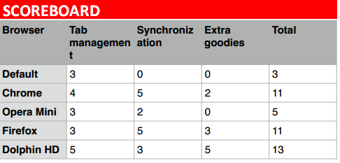
Tab management: The default browser, chrome, Firefox, opera mini have hidden tabs. That is when you are viewing a certain tab you will not be able to see the adjacent tabs. Only Dolphin HD lets you view the open tabs on the top of the page in form of a tab row. The row disappears when you scroll down a webpage. Again it’s about personal preference if you want to view the tabs bar on top or you want to increase room for your web page by a few pixels… I like to view the tabs because it gives a slightly easier access to tabs.
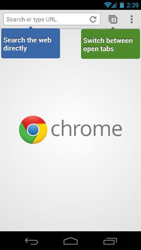
Chrome lets you swipe though the open tabs. This feature is tremendously helpful if you remember the order of your tabs. For extensive tab users, like me, I have many many tabs open at any time so it’s difficult for me to remember the order. Also swiping through 6 to 7 tabs may not be a very efficient idea. In default browser, Firefox stalks up tabs, while Opera Mini displays open tabs in a horizontal fasion. The preview of tabs in firefox and the default browser is way to small to give a complete idea of what page it corresponds too. Again Dolphin HD wins for me here as I always know which tabs are open and loaded and I can access them anytime without having to reach for the tabs button. Firefox manages tabs through a side bar, this is better than having a tabs button as the tabs are just a swipe away. I am always reluctant to the tap than to swipe on touch devices.
Not to mention that in landscape mode you will be able to see a slim tab bar but it was not very touch friendly for me due to small size.
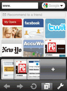
Having said that I find Dolphin HD most efficient in tab management. Firefox is second and Chrome third ( because it lets you swipe from page to page). Default browser and opera mini are last owing to the tab button mechanism they implement. The horizontal tabs mechanism in opera is shown below.
Synchronisation: the default browser does not offer any kind of synchronisation. All the rest browsers offer synchronisation. But to tell you Opera mini synchronisation mechanism via Opera Turbo was awful! Also unlike Chrome and Firefox there is no way in opera to synchronise the open tabs. Dolphin aHD does not have a desktop browser therefore there is little point in synchronisation. Synchronisation work on mobile devices only in dolphin HD.
Word wrap: Opera mini in our experiment always did an efficient word wrap. Chrome and default browser at times did not do word wrap. Firefox stood last in the contest.
Other features:
Besides this Dolphin HD is the first and the only gesture browser that lets you add bookmark with a gesture. I have not used this feature so extensively but it is good when you ant to access a website when you are not in a mood to type. It will also let you speak to your browser. Dolphin has countless add ons and themes. In comparison the default browser and chrome lags behind. Opera mini is no where!! Firefox loses to Dolphin respectably, though as it has quiet a support of add ons and themes. Google Chrome Allows you to browse the web in private mode and send pages to your mobile device and read when offline.
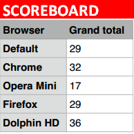
Ease of use: when I firstly launched google chrome I was slightly lost in the UI. I had the same experience with default browser and with Dolphin HD. Opera mini and Firefox were slightly more friendly. However seeing how feature packed dolphin HD is it is understandable the learning curve it presents. The Grand scoreboard ( out of 45)!
The Final Note
According to the grand scoreboard Dolphin HD outshines other browsers. The score got a boost with an additional 5 point for its support for Flash. Google Chrome got the secondposition and both, Firefox and default browser 3rd. Opera mini is last in the contest! But not to forget that opera mini has the best page load time!!
The choice of browser is highly influenced by ones requirements. As in most of the feature showdown we see that dolphin HD wins in usability, features and UI but the page load time of it is considerably lower. In page load time, opera mini wins and owing to compression mechanism it employs also data rates are significantly lower for Opera mini, meaning that using Opera mini is cheap. Dolphin HD has some extra goodies like voice commands, customizable gestures that inceffect efficiency but it still isn’t perfect!It has a weak point I.e. synchronisation feature. Both Chrome and Firefox come in scene here. As both browsers are already well established desktop browsers having the synchronisation feature specially for the open tabs is handy. Having Chrome and Firefox on mobile can minimise the use of extraneous apps such as read it later.
You can read our in- depth critical review of individual browsers on our sister website.


